
Introduction to R for Data Science (Part Seven Final)
This is the seventh introduction to R. This will cover boxplots, variable plotting, coordinates, and more.

PS: Please read ‘Introduction to R for Data Science (Part Six)’ before reading this one. This is a continued version of part six.
Part six: Introduction to R for Data Science (Part Six)
Boxplots

In this case, I have created a barplot using geom_boxplot(). You must include factor() in the x-axis. You don’t have to include it for the y-axis. Boxplots are common for stock pricing. When it comes to a boxplot, you don’t want to oversaturate it, meaning you don’t want to add many layers.
I’m not going to show this in an image, but if you want to flip the coordinate use coord_flip(). Using the image from before, you can write print(pl + geom_boxplot() + coord_flip()). This would flip the coordinates.
Like with the histogram and barplot, you can add color and fill inside geom_boxplot().

Here is an example of using aes(fill=factor(cyl)). Everything should sound familiar if you have read the part six version. The only thing that is new is that I have added a theme_dark() which changes the background color. It doesn’t have to be theme_dark, you can put theme_classic, theme_light, theme_void, etc.
2 Variable Plotting

The 2 variable plotting is like a heat map which indicates high or low counts of ratings (in my case). Not the number, but the occurrence. I have also added scale_fill_gradient() to make it easier to see since the default color is kinda bad.

In this case, I have added a binwidth. Binwidth has to take a vector in this case.
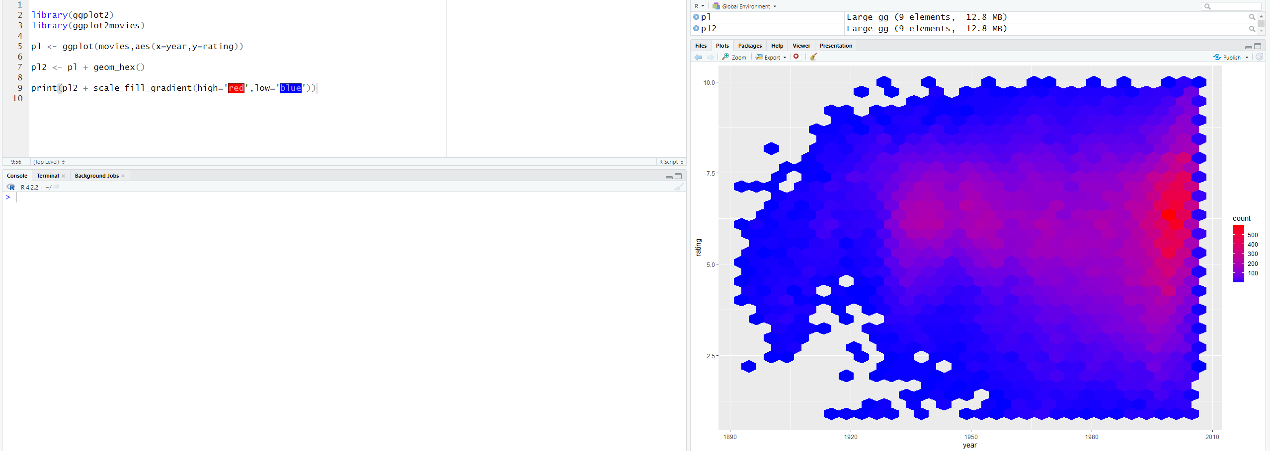
You can change it to hexagon, but you have to install the package which is install.packages('hexbin'). Just change geom_bin2d to geom_hex.

There is also geom_densiy2d(). Just change geom_hex() to geom_density2d().
Coordinates and Faceting
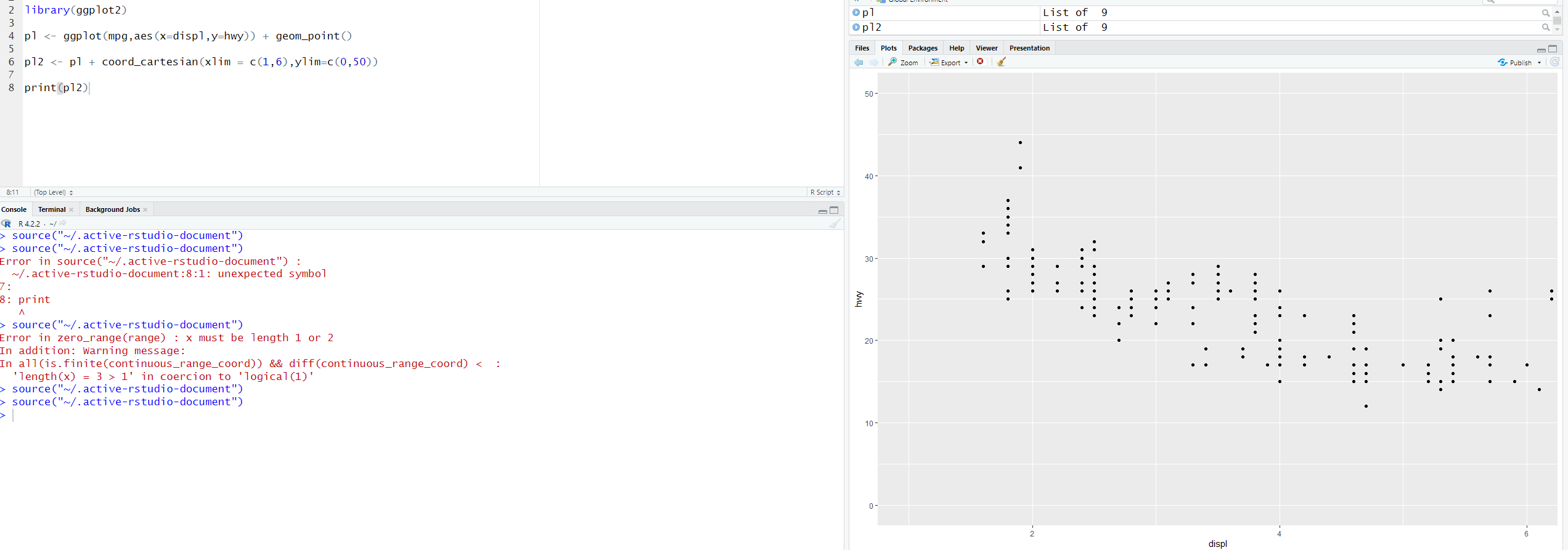
This is how you would coordinate a graph. You can use coord_cartesian() to change the coordinates of the x-axis and y-axis. In the x-axis, I’ve changed it so it goes from one to six. In the y-axis, I’ve changed it so it goes from zero to 50.

There is also coord_fixed() which changes the size of the graph. You must put ratio=, but the numbers can be different. It doesn’t have to be 1/3.
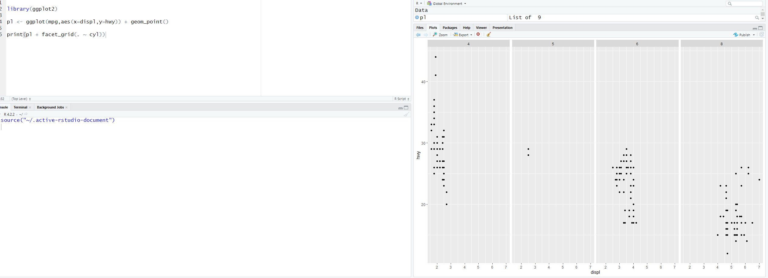
To set multiple points, we can use a facet grid. There is a lot in facet, so it’s best to read the documentation on facet. You can do so by putting help(“facet_grid”) on your console.
In this example, what you want to facet by is on the y-axis till the x-axis. The dot(.) is everything else. It’s the most basic and common.
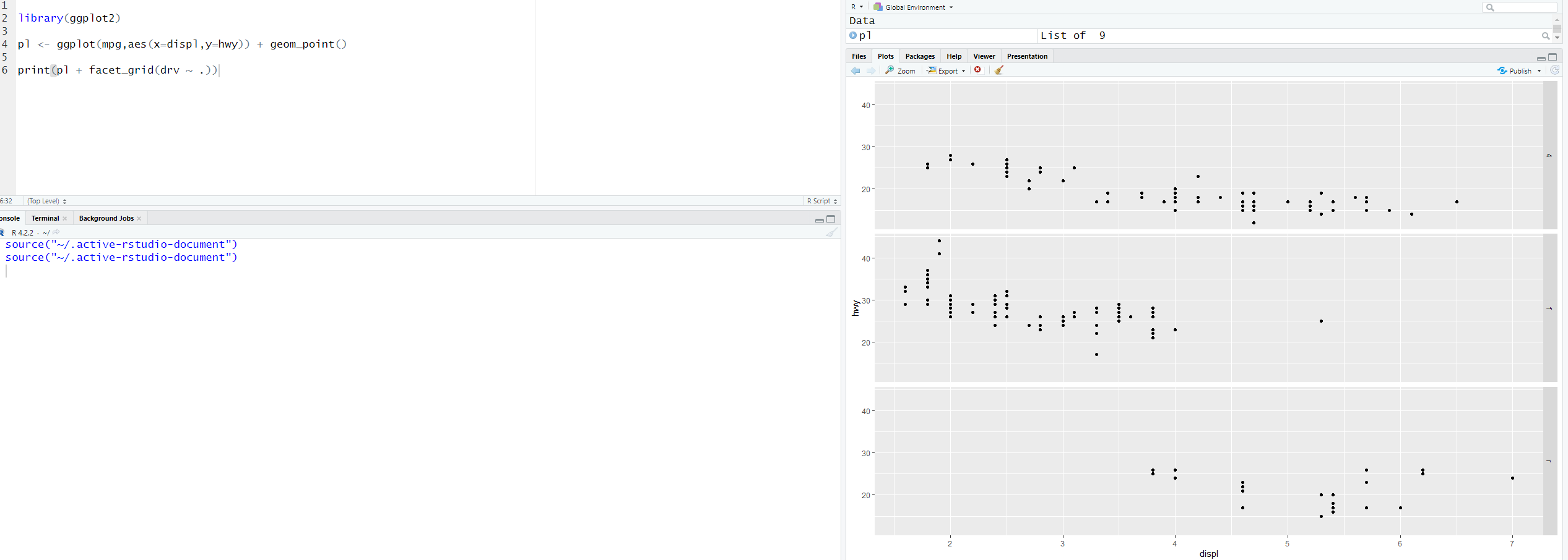
In this example, I switch from the x-axis to the y-axis.
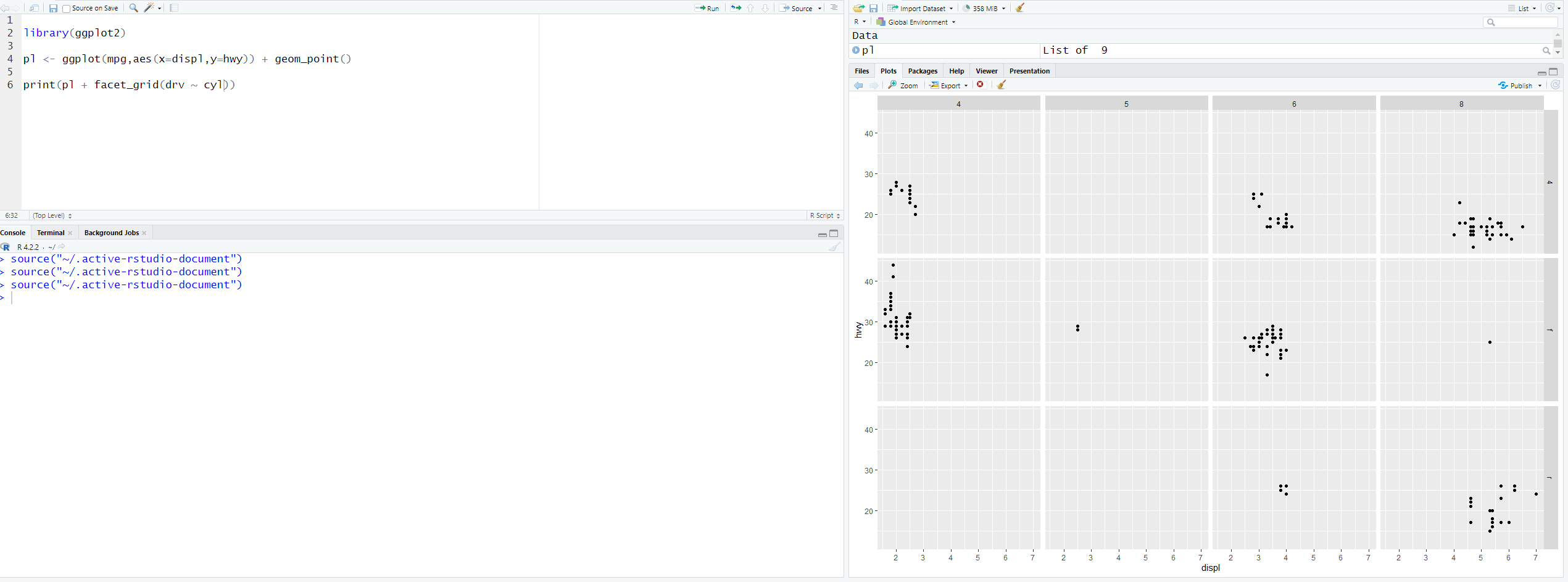
Here is another example where I facet two columns. Just remember the dot till symbol and the column name (. ~ ‘column_name’), it’s the most common.
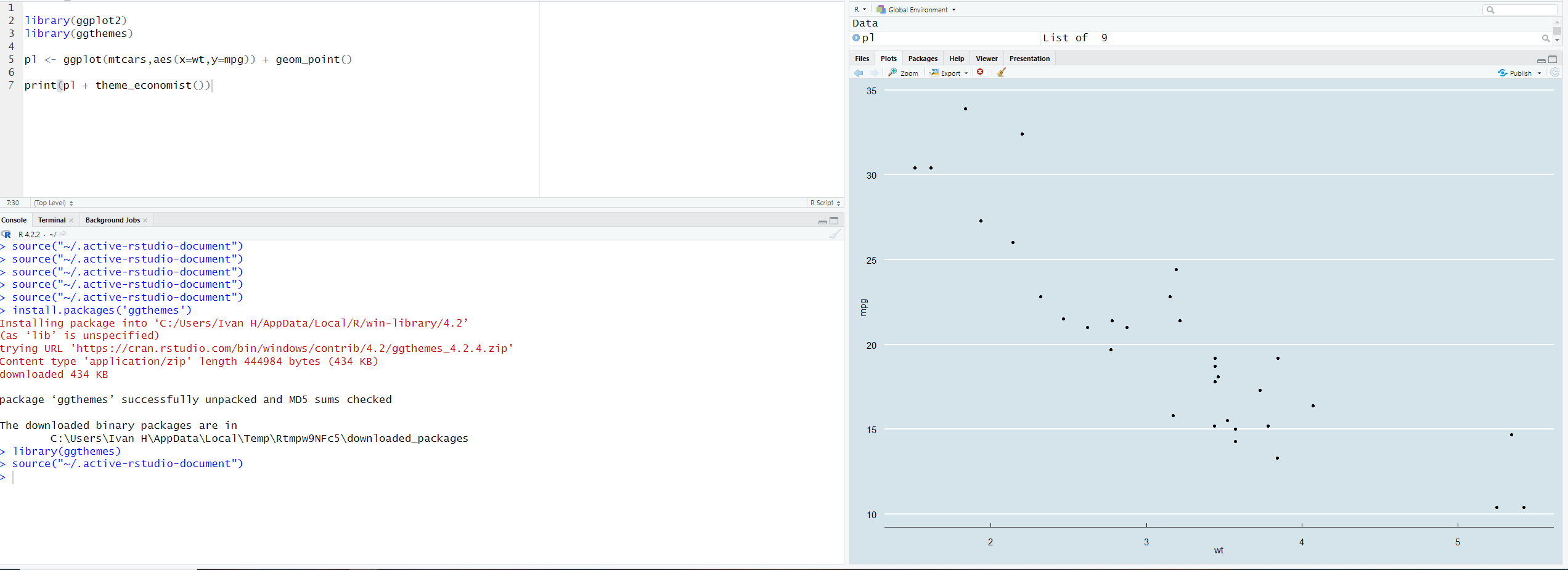
Themes
This is what will help us create beautiful visualization. I have gone over this in boxplots, but there are more themes to choose from. To start, we have to install more themes and you can do so by putting install.packages('ggthemes') on your console.
This will give you more themes to choose from.

[End]