

The Process of Designing a Website
The Process of Designing a Website
Learn the basics when designing a website

Every website should be designed for your target audience, not just yourself. It’s essential to understand who the audience is.
If your target audience is individuals you can ask:
What is the age range?
Which country do they live in?
Do they live in rural or urban areas?
What is the average income?
How often do they use the web?
What kind of devices do they use to access the web?
If your target audience is companies you can ask:
What is the size of the company?
How large is their budget?
What is their job title for people visiting your site?
Why people visit
After you know who your visitors are, you have to consider why they are coming. The goals of your users should influence your design. There are two basic questions you can ask:
What are your user's underlying motivations for coming to your site?
What is the goal of your users?
Information visitors want
Once you know why they’re coming to your site, you now need to work out what information they want in order to achieve their goals effectively and quickly.
Sometimes you may want to offer more supporting information that you think your visitors might find helpful.
You can list out the information from essential to non-essential. That way you can prioritize which information is important and should focus more on that.
Here are some questions to help you decide what information you want to provide:
Are your visitors familiar with the information you’re providing?
Do your visitors need background information in order to understand what you’re covering?
What are the most important features you’re providing to your visitors?
What is special about the offer that differentiates you from others that also offer something similar?
How often do visitors come back?
Some sites will benefit more from being updated than others. Some information, like news, needs to be constantly changing, while others can remain static.
Finding out how often people are likely to revisit your sites will give you an idea of how often you should update your site.
Sometimes it’s beneficial to set a schedule for when a site will be updated.
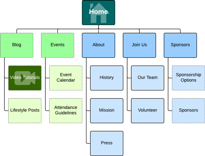
Site Maps
The goal of this is to create a diagram that will be used to structure the site. This is known as a site map.
You should organize related information into groups. Each group will then be grouped together to create different sections of the site.
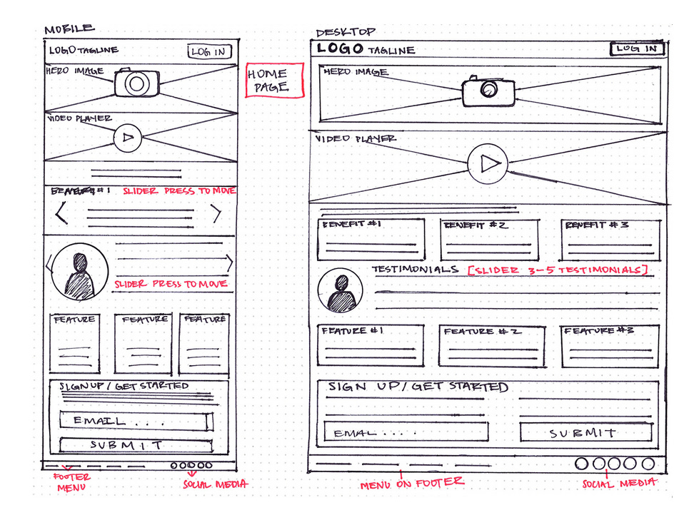
Wireframes
This is a simple sketch of key information that needs to go on each page of the site. It would show the hierarchy and how much space it may require.
You would sketch out each element of the page where it will go, such as logo, navigation, headings, logins, etc.
It helps ensure that all information that needs to be on the site is included and helps you know what information needs to appear on the site.
You shouldn’t include color schemes, font size/choices, or images for the wireframe. It should focus on what information needs to be on the site.
Design
The whole point of design is to communicate. Organizing and prioritizing information will help users understand its importance.
Websites oftentimes have a lot of information to communicate. Designers will need to organize and prioritize the information in order to communicate their messages effectively and also hello users find what they’re looking for.
If everything on a site looks exactly the same, it makes it much harder to understand. Designers can make parts of the page look distinct from surrounding content which will help draw attention to or away from those content. This is known as a visual hierarchy which draws people's attention and then guides them to the following messages.
Some examples of visual hierarchy include:
Size: Larger elements grab the user’s attention first. This is why it’s a good idea to make headings and key points large.
Color: Background color can draw attention to key messages. Brighter sections tend to draw the user’s attention first.
Style: An element with different styles applied to it would make it stand out.
Images will oftentimes attract the eye first. They can be used to draw attention to a specific message within the site. Sometimes images may reveal more than a large paragraph of text.
Other than visual hierarchy, it’s important to group related information together into blocks or chunks. By presenting them in a similar style visitors will learn to associate that style with that particular type of information.
Here is an image of how this can be achieved:
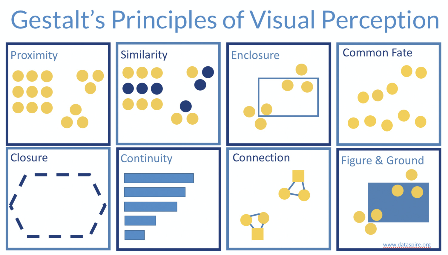
Things that are similar are perceived as more related than things that are dissimilar.
Navigation
Navigation will help visitors understand what your site is about and how it is organized. It follows these rules:
Concise: It should be easy to read. Sometimes it’s better to limit the number of options in a menu to no more than eight links, but it isn’t required. These links will guide users to other pages.
Clear: Users should be able to predict what kind of information they’re expecting before clicking on the link. When possible, choose single descriptive words rather than phrases.
Selective: This should reflect the content of the site. Functions such as logins and search should be placed somewhere else.
Context: It lets users know where they are on the website at that moment. Using different colors or visual markers to indicate the current page is a great way to do this.
Interactive: Each link should be big enough to click on and the appearance should change when the user hovers over each item or clicks on it.
Consistent: It’s best to keep the primary navigation exactly the same.
Sometimes a large site may have primary, secondary, or tertiary navigation. Primary would appear across the top from left to right. Secondary could appear under the primary navigation. Tertiary often sits in the footer section.
[End]