The Beginner Guide to Data Visualization: Turn Data into Beautiful Visuals
Think like a designer when creating data visuals.
Context
Well, the first step in becoming successful in creating data visualization is to start with understanding the context.
Before I get started with context, we need to understand exploratory and explanatory analysis. Exploratory analysis is analyzing the data to understand data and highlight interesting characteristics. In a nutshell, exploratory analysis is just presenting the data. An explanatory analysis is explaining a specific thing or a specific story that you want to tell.
You don’t want to show your audience everything about the data, you want to focus more on the information that your audience needs to know.
Who, what, how
Who
First, we want to start with who is the audience. It’s important to understand who your audience is. Don’t try to focus on a general audience. Different people have different needs, so if you focus on everyone, you wouldn’t be able to communicate with them effectively. Just focus more on narrowing your target audience.
It’s also important to think about the relationship you have with your audience and how they view you.
What
This is the part where you let your audience take action. What do they need to know or do? You should always want your audience to take action.
Some action words:

collaborate, engage, establish, examine, implement, influence, learn, persuade, plan, pursue, recommend, remember, start, try, understamd
Another important factor is to consider your tone. Are you trying to motivate your audience? Are you celebrating? Is the topic serious?
How
After we have finished the who and what, we can focus on the data. Data is supposed to be an evidence supporter. So you would ask yourself what data is going to help you make your point.
3-minute story
The 3-minute story is: if you only have 3 minutes to convey your information to your audience, what would you say? This is a great way to ensure that you are only focusing on important information. The 3-minute story is similar to the elevator pitch.
Structure
It’s also helpful to establish a structure early on to ensure you’ll be successful. You can use Post-it notes, a whiteboard, or a plain piece of paper. It’s much easier to create your structure on a piece of paper or whiteboard since you scratch your idea much faster than using presentation software.
Visual
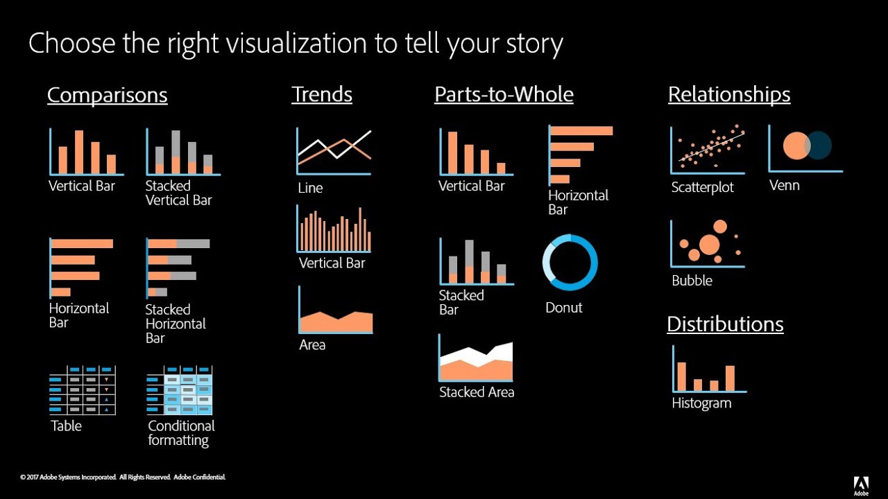
Well, there are a lot of visuals you can choose from. Here are some visuals to choose from:
I’ll go through a few visuals.
Text
When you just have a number to share, a text is a simply great way to communicate. Just have a number and a few supporting words to clearly make your point.
For example, I can write:
18%
of individual people make over $100k per year.
When you have more data to show, a table or graph is what you would use.
Table
Tables contain rows and columns and it’s a good way for your audience to look at a particular row of interest. The issue is your audience would lose their attention on you when they read it, so if you’re talking and they’re reading, you aren’t communicating effectively.
When creating a table, you want your data to take center stage. Don’t have any distractive design or heavy borders that will compete for attention. Just focus solely on presenting your data.
Heatmap
This is where you can leverage colored cells that will convey the magnitude of the numbers.
This would help your brain target the potential points of interest more easily. The higher saturation of blue, the higher the number. You can pick out the lowest number and the highest number more easily.
Be sure to include a low-high subtitle on the heatmap (right side of the image).
Graphs
Graphs will help get your information across more quickly than tables. There are many different kinds of graphs you can choose from such as lines, bars, areas, and more. Some graphs are more effective at conveying information, so it’s up to you to figure out what graph you want.
Scatterplot
Line graph
Slope graph
Bar graph
Horizontal bar chart
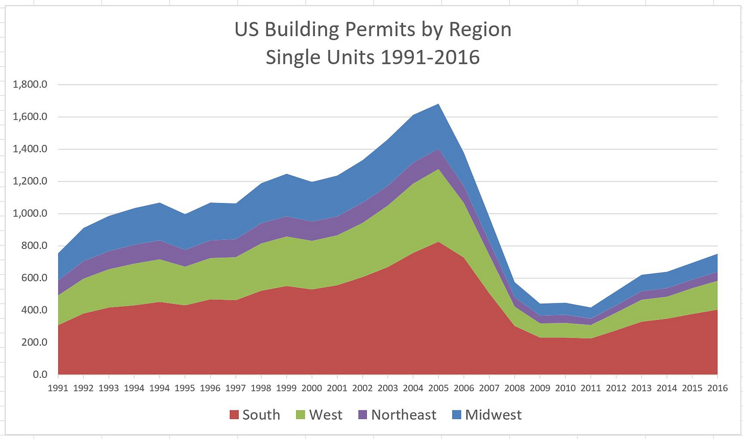
Area chart
Just focus on making your graph easy to understand. You can test this by asking a friend or a colleague and showing them a picture of your visuals. Ask them what they see, what observations they made, and what questions they have.
Clutter
Every time you add an element to a page, you take up the audience’s cognitive load. Cognitive load is the mental effort that’s required when we learn new things. When we ask a computer to do something, we use the computer’s processing power. It’s the same thing with your audience, when we ask our audience to do something, we are using their mental processing power. Humans have limited mental processing power, so we have to be smart about how we use it.
You would want to minimize cognitive load and still be able to get information across to your audience.
Clutters are the most common culprit to excessive cognitive load. They are visual elements that just take up space and don’t serve any purpose. It just makes our visual look more complicated.
If it’s complicated then your audience won’t take the time to understand what you’re showing. If it requires too much brain power then you’ve lost.
Here are some principles to reduce clutter:
Proximity
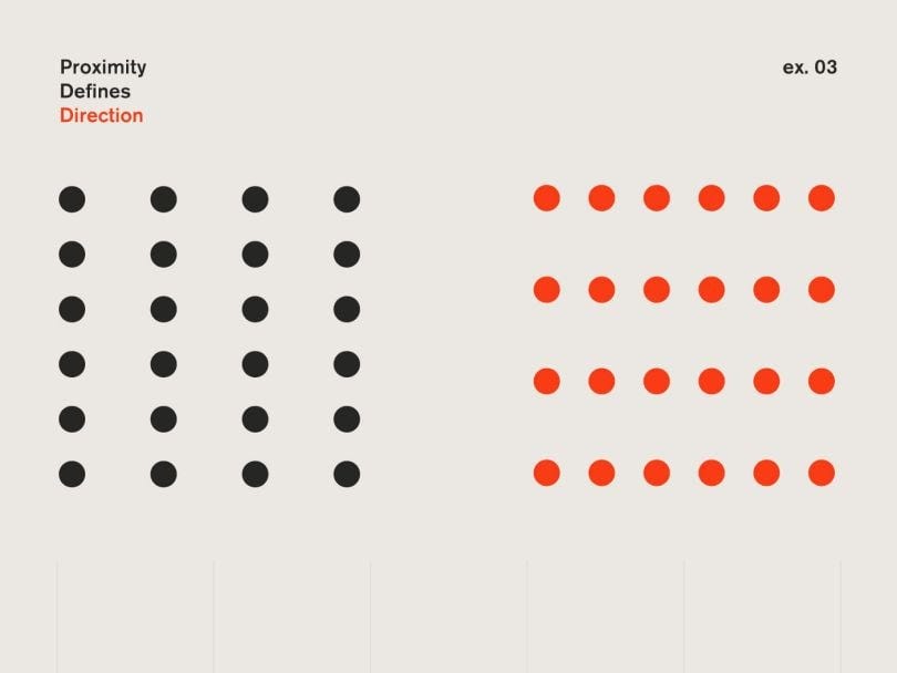
When an object is physically close together, we see them as part of a group.
Proximity can be used in table design by using spacing between the dots
Similarity
Objects that are similar in shape, size, color, or orientation are perceived as similar or belonging to part of a group. This will help draw your audience's eyes to the direction you want them to focus on.
Enclosure
We think of objects enclosed together as part of a group. A light background shading is often enough.
Closure
When parts are missing people will fill in the gaps. So you don’t need to include things such as chart borders and background shading.
Alignment
Your audience would tend to start from the top left and move their eyes in a “z” shape across the page. It’s recommended to put text in the upper-left. This way, the audience can read the details about the table/graph and then the table/graph itself.
Attention
We want to help direct our audience’s attention to the things that we want them to focus on. We can do this through the use of size, color, and position.
There are three types of memory that are important to understand:
iconic memory
short-term memory
long-term memory
Iconic memory is fast. The information would stay in your iconic memory before it goes to your short-term memory
Short-term memory is limited. People keep small about of visual information in their short-term memory at a given time. This is why we don’t want our audience to work to get at the information, because we’ll end up losing their attention.
Long-term memory is taking information from short-term memory and creating long memories. Images can help us recall things stored in our long-term memory. For example, looking at a picture of the White House might give you feelings or experiences that you’ve had in Washington DC, or in politics.
Here are various attributes:
Your eyes are probably drawn to one element within each group. That is because our brain is hardwired to quickly pick up differences we see.
Preattentive attributes are useful for drawing the audience’s attention quickly and creating a visual hierarchy of information.
Visual hierarchy is what will help us draw our audience's attention. Here are some examples of visual hierarchy:
This makes our information more easily scannable. Studies show people have an 8-second attention span, so we have to use those 8 seconds effectively.
We can signal what’s the most important first, then the second important, then the third, and so on. Don’t have components that will compete for attention.
Size
Well, size does matter in design. If there is one important thing, make it BIG. Big sizes indicate importance.
If you’re showing multiple things that are equally important then make them the same size.
Color
Don’t use color just for the sake of being colorful. Use colors as a way to highlight important parts of your visuals.
Color has to be used in small quantities. We don’t want to use all the colors in a rainbow. Too much variety would prevent anything from sticking out. There needs to be sufficient contrast for it to draw your audience’s attention. A better alternative is to use a heatmap just to make it simple and easy to read.
Use color consistently. A change in color signals a change. So use it when you want your audience to feel a change. However, there are times when color must be consistent. If your audience familiarizes themselves with what the color means in your graphs then they’ll assume the same details apply throughout the rest of the graph. Don’t confuse your audience by changing color.
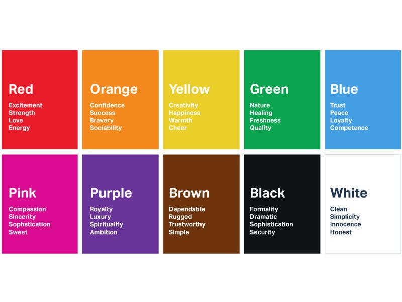
Tones play an important part in color. Color evokes emotion within us. Therefore you have to ask yourself what kind of emotion you want to invoke in your audience. Is the topic serious or light? Here is an example of how color affects emotions:
Distractions
When highlighting important parts, we also want to eliminate distractions. Here are some considerations to help you identify potential distractions:
Not all data are important. Get rid of noncritical data
Summarize if details aren’t needed. You should know the details of your data, but your audience doesn’t need to know everything, so summarize when appropriate.
Ask yourself: Would removing this change anything? If it’s no then remove it. If they don’t have a purpose, remove them.
Here are some tips to make it more simple:
Make it readable: use consistent, easy-to-read font (consider size and typeface)
Use simple language that a beginner can understand: choose simple over complex language, choose fewer words, define any language that your audience may not be familiar with, and spell out acronyms.
Remove useless complexity: when choosing between simple and complex, choose simple.
Overall keep it clean: don’t put useless junk on your data visualization
Aesthetics
It is necessary to make the data visuals pretty. Here are some things to consider:
Use color wisely. use it with limited quantities and to highlight important parts of your visuals
Pay attention to alignment. Organize parts to create clean vertical and horizontal lines
Use white space. Preserve margins; don’t stretch out your visuals to fill the space or add things because you have extra space.
Well, that is everything that you need to know to create beautiful visuals. The most important thing to remember is to keep it simple and clean.
[END]





![proximity [Art & Design Foundations] proximity [Art & Design Foundations]](https://substackcdn.com/image/fetch/$s_!dvtR!,w_1456,c_limit,f_auto,q_auto:good,fl_progressive:steep/https%3A%2F%2Fsubstack-post-media.s3.amazonaws.com%2Fpublic%2Fimages%2F2b96a942-182e-4d72-9fd4-73f42b85d0f1_294x171.png)
