
CSS Dictionary - A Guide for Beginners (Part Three Final)
Positioning, Floats, Images, Layout, Screen Size, Screen Resolutions

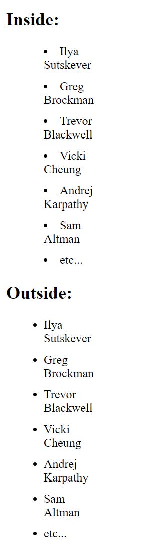
Positioning Marker
list-style-position
This is to make whether the market should appear inside or outside of the box. There are two values:
inside: marker sits inside the box of text
outside: marker sits to the left of the block of text
ul {
    width: 200px;
}


li {
    margin: 10px;
}


#first {
    list-style-position: inside;
}


#second {
    list-style-position: outside;
}
Shorthand
list-style
You can shorthand everything by using list-style.
#first {
    list-style: circle;
}
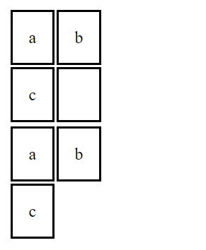
Border on Empty Cells
empty-cells
If you have an empty cell you can use this property to specify if you want the border to show or not
It can have one of three values:
show: This will show the border on empty cells
hide: This will not show
inherit: If you have one table nested inside another, the inherit will instruct the table cells to obey the rules of containing table
HTML
        <table id="first">
            <tr>
                <td>a</td>
                <td>b</td>
            </tr>
            <tr>
                <td>c</td>
                <td></td>
            </tr>
        </table>


        <table id="second">
            <tr>
                <td>a</td>
                <td>b</td>
            </tr>
            <tr>
                <td>c</td>
                <td></td>
            </tr>
        </table>
CSS
td {
    border: 2px solid black;
    padding: 15px;
}


#first {
    empty-cells: show;
}


#second {
    empty-cells: hide;
}
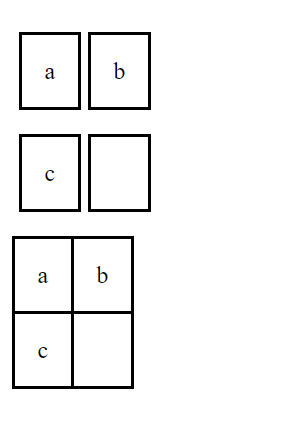
Gaps
border-spacing, border-collapse
The border-spacing will allow you to control the distance between cells. By default, browsers will often leave a small gap between each table cell. The value is specified in pixels. You can use two numbers to specify two values if you want different horizontal and vertical spacing.
If you don’t want spacing then you would use border-collapse. This has two values:
collapse: collapsed into a single border
separate: detached from each other
td {
    border: 2px solid black;
    padding: 15px;
}


#first {
    border-spacing: 5px 16px;
}


#second {
    border-collapse: collapse;
}
Cursor Styles
cursor
This will allow you to control the type of mouse cursor that should be displayed to users. For example, you might change a cursor to be crosshair when a user hovers over a link (this is an example, and you shouldn’t actually do that).
Here are some commonly used values:
auto
crosshair
default
pointer
text
move
help
wait
url()
Layout
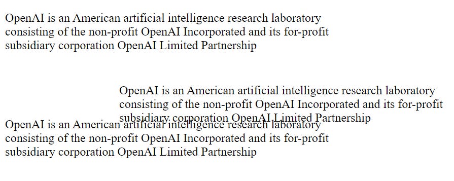
Normal Flow
position:static
This is positioned as the normal flow, each block-level element sits on top of the next one. You would not need a CSS property to indicate that elements should appear in normal flow.
You would only need to write,
position:static;
HTML
        <p>OpenAI is an American artificial intelligence research laboratory consisting of the
        non-profit OpenAI Incorporated and its for-profit subsidiary corporation OpenAI Limited Partnership</p>


        <p id="first">OpenAI is an American artificial intelligence research laboratory consisting of the
        non-profit OpenAI Incorporated and its for-profit subsidiary corporation OpenAI Limited Partnership</p>


        <p id="second">OpenAI is an American artificial intelligence research laboratory consisting of the
        non-profit OpenAI Incorporated and its for-profit subsidiary corporation OpenAI Limited Partnership</p>
CSS
body {
    width: 750px;
}


p {
    width: 450px;
}


#first {
    position: static;
}
Relative Positioning
position:relative
This moves an element in relation to where it would have been in normal flow. For example, you can move 15 pixels lower than it would have been in normal flow.
You can use the top, or bottom, left, or right to indicate how far to move the element from where it was in the normal flow.
To move the box up or down, you use the top or bottom (you can only use either top or bottom).
To move the box horizontally, you use the right or left (you can only use either right or left).
#first {
    position: relative;
    top: 25px;
    left: 150px;
}
Absolute Positioning
position:absolute
When you use absolute, the box is taken out of normal flow and no longer affects the position of other elements on the website.
Like before, you can use top or bottom, left or right.
*Changed some words in HTML
        <p>OpenAI is an American artificial intelligence research laboratory consisting of the
        non-profit OpenAI Incorporated and its for-profit subsidiary corporation OpenAI Limited Partnership</p>


        <p id="first">In December 2015, Sam Altman, Greg Brockman, Reid Hoffman, Jessica Livingston, Peter Thiel,
            Elon Musk, Amazon Web Services (AWS), Infosys, and YC Research announced[9] the formation of OpenAI and
            pledged over $1 billion to the venture. According an investigation led by TechCrunch, the non-profit's funding
            remains murky, with Musk its biggest funder while another donor, YC Research, did not contribute anything at all</p>


        <p id="second">According to Wired, Brockman met with Yoshua Bengio, one of the "founding fathers" of the
        deep learning movement, and drew up a list of the "best researchers in the field"</p>
CSS
#first {
    position: absolute;
    top: 55px;
    left: 150px;
}
Fixed Positioning
position:fixed
This position the element in relation to the browser window. So when a user scrolls down the page, it stays in the exact same place.
It’s commonly used for heading. For example, when a user scrolls down, on some websites the heading stays in place as you scroll, it doesn’t go away.
You would have to use margin-top as the <p> elements are in normal flow and the <h1> element would prevent the first <p> element from being seen.
HTML
        <p id="first">OpenAI is an American artificial intelligence research laboratory consisting of the
        non-profit OpenAI Incorporated and its for-profit subsidiary corporation OpenAI Limited Partnership</p>


        <p>In December 2015, Sam Altman, Greg Brockman, Reid Hoffman, Jessica Livingston, Peter Thiel,
        Elon Musk, Amazon Web Services (AWS), Infosys, and YC Research announced[9] the formation of OpenAI and
        pledged over $1 billion to the venture. According an investigation led by TechCrunch, the non-profit's funding
        remains murky, with Musk its biggest funder while another donor, YC Research, did not contribute anything at all</p>


        <p>According to Wired, Brockman met with Yoshua Bengio, one of the "founding fathers" of the
        deep learning movement, and drew up a list of the "best researchers in the field"</p>
CSS
h1 {
    position: fixed;
    top: 0px;
    left: 0px;
    padding: 10px;
    margin: 0px;
    width: 100%;
    background-color: gray;
}


#first {
    margin-top: 70px;
}
Overlapping Elements
z-index
Sometimes boxes can overlap when you use relative, fixed, or absolute positioning, so you want to use the z-index property. The value is a number, and the higher the number the closer that element is to the front. For example, an element with a z-index of 10 will appear over the top of an element with a z-index of 5.
By default, if you use relative positioning, they would appear over the top of the heading as the user scrolls down. To ensure <h1> stays on top, we use z-index.
h1 {
    position: fixed;
    top: 0px;
    left: 0px;
    padding: 10px;
    margin: 0px;
    width: 100%;
    background-color: gainsboro;
    z-index: 5;
}


#first {
    position: relative;
    top: 10px;
    left: 15px;
}
Before I used z-index

After I used z-index

Floating Elements
float
This allows you to take an element in normal flow and place it as far to the right or left of the containing element as possible.
Anything else that sits inside the containing element will flow around the element that is floated.
When you use float, you should use width to indicate how wide the floated element should be.
#first {
    float: right;
    width: 200px;
    font-size: 120%;
    margin: 0px 0px 10px 10px;
    padding: 10px;
    border: 2px solid black;
}
Elements side-by-side
Float is a great way to place boxes next to each other.
p {
    float: left;
    width: 200px;
    font-size: 120%;
    margin: 5px;
    padding: 10px;
    border: 2px solid black;
}
Clearing Floats
clear
This allows you to say that no element should touch the right or left-hand sides of a box. It takes the following values:
left: the left-hand side of the box shouldn’t touch any other elements appearing in the same containing element
right: the right-hand side of the box shouldn’t touch any other elements appearing in the same containing element
both: neither the left nor right-hand sides of the box will touch any other elements appearing in the same containing element
none: elements can touch either side
body {
    width: 500px;
}


p {
    float: left;
    width: 200px;
    font-size: 120%;
    margin: 5px;
    padding: 10px;
    border: 2px solid black;
}


#erase {
    clear: left;
}
Screen Sizes
Different users will have different-sized screens that show them different amounts of information, so your design needs to work on different ranges of sizes.
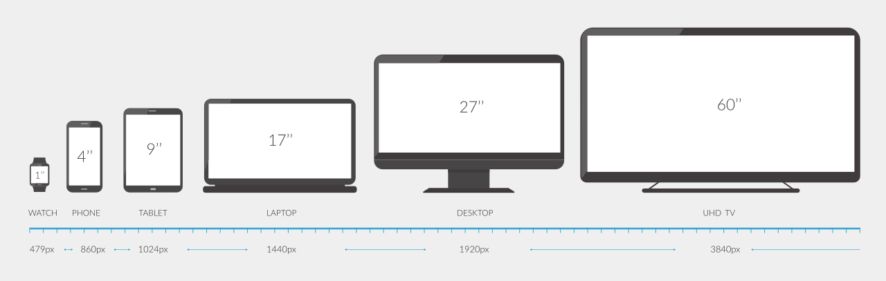
Some people might be viewing your site on a 17-inch laptop while some may have a 27-inch monitor. This will affect how much of the page they will see.
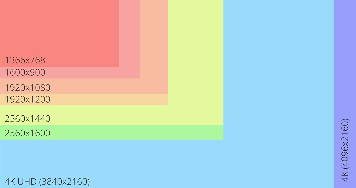
Screen Resolution
Resolution refers to the number of dots a screen shows per inch. Some devices have higher resolutions while some have smaller resolutions. Most operating systems allow the user to adjust the resolution of their screens.
Images
Controlling Sizes of Images
You can control the size of an image using width and height in CSS.
#large {
    width: 500px;
    height: 500px;
}


#medium {
    width: 250px;
    height: 250px;
}


#small {
    width: 100px;
    height: 100px;
}
Centering Images
In order to center an image, it should turn into a block-level element using the display property with a value of block. Once you have made it a block-level element, you can center an image through,
Using text-align with a value of center on the containing element
On the image itself by using the margin and set the values of the left and right margins to auto
HTML
<img class="center" src="images/Screenshot (740).png" alt="">CSS
img.center {
    display: block;
    margin: 0px auto;
    width: 500px;
    height: 500px;
}
Background Images
background-image
This allows you to place an image behind any HTML element. This is basically a background texture that you can use on your page.
body {
    background-image: url(images/Screenshot\ \(740\).png);
}


h1, p {
    color: white;
    font-size: 50px;
}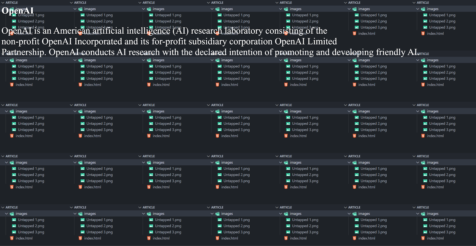
Repeating Images
background-repeat, background-attachment
The background-repeat has four values:
repeat: background image is repeated both horizontally and vertically
repeat-x: image is repeated horizontally
repeat-y: image is repeated vertically
no-repeat: image is shown once
The background-attachment specifies whether a background image should stay in one position or move when the user scrolls up or down the page. It has two values:
fixed: background image stays in the same position
scroll: background image moves up and down as the user scrolls
body {
    background-image: url(images/Screenshot\ \(740\).png);
    background-repeat: repeat-y;
}
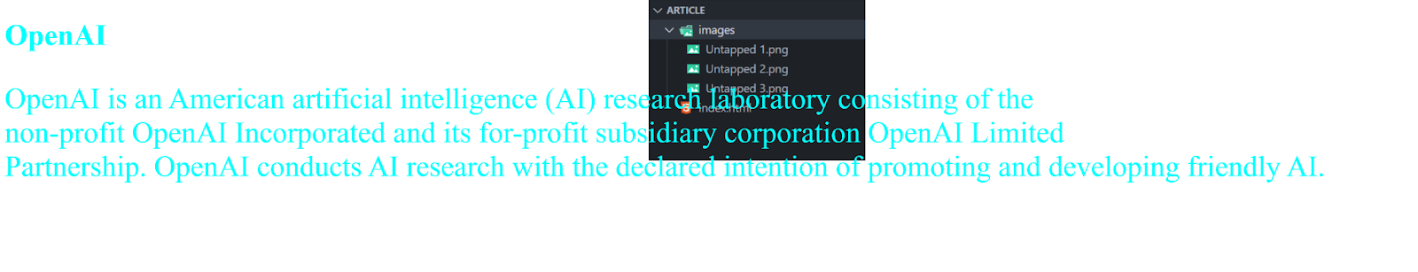
Background Position
background-position
When an image isn’t repeated, you can use this property to specify where in the browser window the background image should be placed.
This property has two values. The first represents the horizontal position and the second is vertical. So like,
left top
left bottom
center top
center center
If you only specify one value the second value default to center.
You can use pixels or percentages.
body {
    background-image: url(images/Screenshot\ \(740\).png);
    background-repeat: no-repeat;
    background-position: center top;
}
Shorthand
background
This property acts like a shorthand for all the other background properties I’ve shown you. The properties must be specified in the following order, but you can miss any value if you don’t want to specify it,
background-color
background-image
background-repeat
background-attachment
background-position
body {
    background: gray url(images/Screenshot\ \(740\).png) no-repeat bottom center;
}
[End]