
CSS Dictionary - A Guide for Beginners (Part Two)
Text Continued, Boxes, Padding, Margins, Tables, Lists, and Forms

Indenting Text
text-indent
This will allow you to indent the first line of text within the element. This is usually specified in either pixels or ems.
#first {
    text-indent: 20px;
}


#second {
    text-indent: 100px;
}
Drop Shadow
text-shadow
This is used to create a drop shadow, which is a dark version of the word just behind it. It can take three lengths and a collar:
The first indicates how far to the left or right the shadow should fall
The second indicates the distance to the top o bottom that the shadow should fall
The third is optional and specifies the amount of blur that should be applied
The fourth is the color of the drop shadow
h1 {
    background-color: pink;
    color: gray;
    text-shadow: 1px 1px 0px #000000;
}


h3 {
    background-color: aqua;
    color: gray;
    text-shadow: 1px 1px 3px gray;
}


#first {
    background-color: blue;
    color: white;
    text-shadow: 2px 2px 6px black;
}


#second {
    background-color: #aaaaaa;
    color: #ffffff;
    text-shadow: -1px -2px #666666;
}
First Letter or Line
:first-letter, :first-line
You can specify different values for the first letter or first line of text. These are known as pseudo-elements.
#first::first-letter {
    font-size: 250%;
}


#second::first-line {
    font-weight: bolder;
}
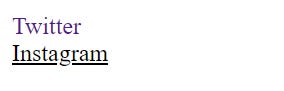
Styling Links
:link, :visited
:link
This will allow you to set styles for links that haven’t been visited yet.
:visited
This allows you to set styles for links that have been clicked on.
They are commonly used to control the colors of links and also whether they are to appear underlined or not
#link:link {
    color: aqua;
    text-decoration: none;
}


#link2:visited {
    color: black;
}
Responding to Users
:hover, :active
:hover
This is applied when users hover over an element with a mouse. This is commonly used to change the appearance of links and buttons when a user places their cursor over them. This doesn’t work on touch screens though.
:active
This is applied when an element is being activated by a user. For example, when a button is being pressed. This is used to make it feel like the button is being pressed changing the style of the element slightly
Attribute Selectors
There are also sets of attributes that allow you to create rules that apply to elements that have an attribute with a specific value.
Existence
[]: Matches a specific attribute
Example: p[class] targets any <p> element with an attribute called class
Equality
[=]: Matches a specific attribute with a specific value
Example: p[class=”cat”] targets any <p> element with an attribute called class whose value is cat
Space
[~=]: Matches a specific attribute whose value appears in a space-separated list of words
Example: p[class~=”cat”] targets any <p> element with an attribute called class whose value is a list of space-separated words, one of which is cat
Prefix
[^=]: Matches a specific attribute whose value begins with a specific string
Example: p[attr^”c”] targets any <p> element with an attribute whose value begins with the letter “c”
Substring
[*=]: Matches a specific attribute whose value contains a specific substring
Example: p[attr*”as”] targets any <p> element with an attribute whose value contains the letters “as”
Suffix
[$=]: Matches a specific attribute whose value ends with a specific string
Example: p[attr$”a”] targets any <p> element with an attribute whose value ends with the letter “a”
Boxes
Box Dimensions
width, height
To set your own dimensions for a box you can use height and width.
The most popular way to specify the size of a box is to use pixels, ems, or percentages.
When you use percentages, the size of the box is relative to the size of the browser window, or if it’s encased within another box, it’s a percentage of the size of the containing box.
When you use ems, the size of the box is based on the size of the text within it.
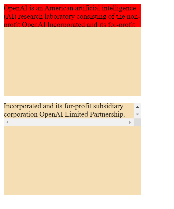
HTML Code
    <body>
        <div>
            <p id="first">OpenAI is an American artificial intelligence (AI) research laboratory consisting of the non-profit OpenAI Incorporated and its for-profit subsidiary corporation OpenAI Limited Partnership.</p>
        </div>
    </body>
CSS
div {
    height: 200px;
    width: 300px;
    background-color: darkblue;
}


#first {
    height: 80%;
    width: 80%;
    background-color: red;
}
Limiting Width
min-width, max-width
Min-width will specify the smallest size a box can be displayed at when the browser window is narrow.
Max-width will indicate the maximum width a box can stretch to when the browser window is wide.
These help ensure the contents of pages are legible. You don’t want text to appear too wide within a big browser window or too narrow for a small browser window.
#first {
    min-width: 300px;
    max-width: 800px;
    background-color: red;
}
Limiting Height
min-height, max-height
This is the same as width but it’s based on height instead.
#first {
    min-width: 300px;
    max-width: 800px;
    min-height: 10px;
    max-height: 90px;
    background-color: red;
}
Overflowing Content
overflow
This will tell the browser what to do if the content contained within a box is larger than the box itself. It has one of two values:
Hidden: This hides any extra content that does not fit in the box
Scroll: This will add a scrollbar to the box so the user can scroll to see the missing content.
div {
    height: 200px;
    width: 300px;
    background-color: wheat;
}


#first {
    min-width: 300px;
    max-width: 800px;
    min-height: 10px;
    max-height: 50px;
    background-color: red;
    overflow: hidden;
}


#second {
    min-width: 300px;
    max-width: 800px;
    min-height: 10px;
    max-height: 50px;
    overflow: scroll;
}
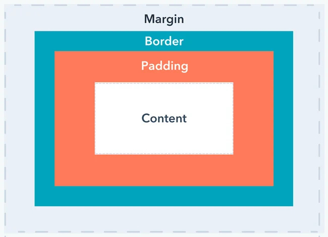
Border, Margin, and Padding
Every box has three properties that can be adjusted:
Border: Every box has a border. The border separates the edge of one box from another.
Margin: This sits outside the edge of the border.
Padding: This is the space between the border of a box and any content contained within it. Padding can increase the readability of its contents.
Padding and Margin are helpful in adding space between various items on the page.
Border Width
border-width
This is used to control the width of a border. This can be given in pixels or one of the following values:
Thin
Medium
Thick
(You cannot use percentages)
You can also specify different widths for the four border values. These are:
border-top-width
border-right-width
border-bottom-width
border-left-width
You can also specify different widths for the four border values like:
border-width: 2px 6px 12px 4px;
These values appear in clockwise order: top, right, bottom, left.
#first {
    border: solid black;
    border-width: 2px;
}


#second {
    border: solid black;
    border-width: thick;
}


#third {
    border: solid black;
    border-width: 2px 6px 12px 4px;
}
Border Style
border-style
You can control the style of a border using this property. It has the following values:
solid: single solid line
dotted: series of square dots
dased: series of short lines
double: two solid lines
groove: carved into the page
ridge: appears to stick out from the page
inset: appears to be embedded into the page
outset: out of the screen
hidden/none: no border shown
You can change the style of different borders using:
border-top-style
border-left-style
border-right-style
border-bottom-style
#first {
    border-style: solid;
}


#second {
    border-style: dotted;
}


#third {
    border-style: dashed;
}


#fourth {
    border-style: double;
}


#fifth {
    border-style: groove;
}


#sixth {
    border-style: ridge;
}


#seventh {
    border-style: inset;
}


#eighth {
    border-style: outset;
}


#nineth {
    border-style: hidden;
}
Border Color
border-color
You can specify the color using hex codes, CSS color names, or RGB values.
Like before you can individually control the colors of different sides of a box using:
border-top-color
border-left-color
border-right-color
border-bottom-color
You don’t have to use this, you can control all four border controls in one property like,
border-color: gray blue black pink;
#first {
    border: solid;
    border-color: aqua;
}


#second {
    border: solid;
    border-color: gray blue black pink;
}
Easy way to do Border
border
The border property allows you to do everything I have shown you in one property.
#first {
    border: 5px solid black;
}


#second {
    border: dotted darkblue
}
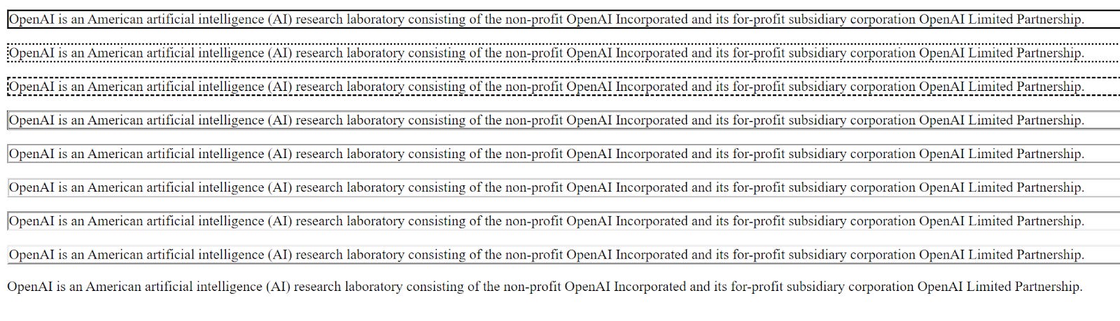
Padding
padding
This allows you to specify how much space should appear between the content of an element and its border.
This is most often specified in pixels (possible to use percentages or ems). If you use percentage, padding is a percentage of the browser window (or the containing box if it is inside another box).
You can specify different values for each side of the box:
padding-top
padding-left
padding-right
padding-bottom
You can shorthand using:
padding: 10px 15px 5px 1px;
#first {
    border: solid black;
}


#second {
    border: solid black;
    padding: 10px;
}
Margin
margin
This will control the gap between boxes. You can use pixels, percentages, or ems.
You can specify different values for each side of the box:
margin-top
margin-left
margin-right
margin-bottom
You can shorthand using:
margin: 1px 5px 9px 3px;
#first {
    border: solid black;
    padding: 10px;
}


#second {
    border: solid black;
    margin: 25px;
}
Centering Content
You can set left-margin and right-margin to auto to center a box on the page.
To center a box, you need to set a width for the box. Once you have specified the width, set the left and right margins to auto. This will make the browser put an equal gap on each side of the box.
body {
    text-align: center;
}


p {
    width: 200px;
    padding: 40px;
    border: 15px solid black;
}


p#second {
    margin: 10px auto 10px auto;
}
(PS: This is aligned center, but I cropped the picture, so it appears on the right)
Changing Inline/Block
display
This will allow you to turn an inline element into a block-level element.
The values it can take are:
inline: causes the block-level element to act like an inline element
block: causes the inline element to act like the block-level element
inline-block: cause a block-level element to flow like an inline element
none: hides an element from the page
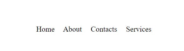
HTML
        <ul>
            <li>Home</li>
            <li>About</li>
            <li>Contacts</li>
            <li>Services</li>
            <li id="soon">Hello</li>
        </ul>
CSS
li {
    display: inline;
    margin-right: 15px;
}


li#soon {
    display: none;
}
Hiding Boxes
visibility
This allows you to hide boxes from users but leaves space where the element would have been.
This can take two values:
hidden: hides the element
visible: shows the element
If you don’t want blank space, you should use the display property with the value of none.
HTML
        <ul>
            <li>Home</li>
            <li>About</li>
            <li id="soon">Contacts</li>
            <li>Services</li>
            <li>Help</li>
        </ul>
CSS
li {
    display: inline;
    margin-right: 15px;
}


li#soon {
    visibility: hidden;
}
Rounded Corners
border-radius
You can create rounded corners on any box by using this property. The value indicates the size of the radius in pixels.
You can specify different values for each side of the box:
border-top-right radius
border-top-left radius
border-bottom-right radius
border-bottom-left radius
You can shorthand these four properties such as,
border-radius: 6px 10px 6px 10px
#first {
    border: 6px solid black;
    padding: 25px;
    width: 200px;
    border-radius: 18px;
}
Tables, Lists, and Forms
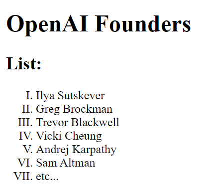
Bullet Point Styles
list-style-type
This will allow you to control the style and shape of a bullet point. This is applied to the <ol>, <ul>, and <li> elements.
Unordered Lists
You can use the following values: none, disc, circle, square
Ordered Lists
You can use the following values: decimal, decimal-leading-zero, lower-alpha, upper-alpha, lower-roman, upper-roman
HTML Code
        <h1>OpenAI Founders</h1>
        <h2>List:</h2>
        <ol>
            <li>Ilya Sutskever</li>
            <li>Greg Brockman</li>
            <li>Trevor Blackwell</li>
            <li>Vicki Cheung</li>
            <li>Andrej Karpathy</li>
            <li>Sam Altman</li>
            <li>etc...</li>
        </ol>
CSS
ol {
    list-style-type: upper-roman;
}
Images for Bullets
list-style-image
You can specify an image to act as a bullet point by using this property.
The value starts with the letter URL and is followed by parentheses. You would give the path to your image.
This can be used on <ul> and <li> elements.
        <h1>OpenAI Founders</h1>
        <h2>List:</h2>
        <ul>
            <li>Ilya Sutskever</li>
            <li>Greg Brockman</li>
            <li>Trevor Blackwell</li>
            <li>Vicki Cheung</li>
            <li>Andrej Karpathy</li>
            <li>Sam Altman</li>
            <li>etc...</li>
        </ul>
CSS
ul {
    list-style-image: url(images/Screenshot\ \(740\).png);
}


li {
    margin: 12px 0px 0px 0px;
}
[End Of Part Two]