
CSS Dictionary - A Guide for Beginners (Part One)
External CSS, Internal CSS, CSS Selectors, CSS Rules, Colors, Text

CSS will allow you to specify how the content should appear. For example, you can specify that the background of the page is gray, paragraphs should appear in white, or all headings should be in blue, italics.
It operates by applying rules to specific HTML elements. Each CSS rule consists of a selector, which targets the desired elements, and a declaration, which specifies the desired style properties and values.
p {
    font-family: 'Times New Roman', Times, serif;
}
The selector for this example is “p” and the declaration is “font-family: 'Times New Roman', Times, serif;”
CSS declarations will sit inside curly brackets and each is made up of two parts: a property and a value, separated by a colon.
Properties indicate the aspect that you want to change. For example font, color, height, width, and border. In the example above, “font-family” is the property.
Values specify the settings that you want to use for the chosen properties. For example, if you want to specify the color, you would put the value in the text. In the example above, “'Times New Roman', Times, serif” is the value.
External CSS
<link>
This is used in an HTML document to tell the browser where to find the CSS file used to style the website.
href
This specifies the path to the CSS file.
rel
This specifies the relationship between the HTML page and the file it’s linked to. This should be named stylesheet.
<!DOCTYPE html>
<html>
    <head>
        <meta charset="utf-8">
        <meta http-equiv="X-UA-Compatible" content="IE=edge">
        <title></title>
        <meta name="description" content="">
        <meta name="viewport" content="width=device-width, initial-scale=1">
        <link rel="stylesheet" href="style.css">
    </head>
    <body>
        <h1>Hello World</h1>
    </body>
</html>
In the example above rel is named “stylesheet” and href is named “style.css”. Style.css is the name of the CSS file I’ve created.

Internal CSS
<style>
You can also have CSS rules inside the HTML page by placing <style>. You do not want to do this though as it can make your HTML document extremely long and confusing.
But for example, it’ll look like this,
<!DOCTYPE html>
<html>
    <head>
        <meta charset="utf-8">
        <meta http-equiv="X-UA-Compatible" content="IE=edge">
        <title></title>
        <meta name="description" content="">
        <meta name="viewport" content="width=device-width, initial-scale=1">
        <style>
            h1 {
                color: aqua;
            }
        </style>
    </head>
    <body>
        <h1>Hello World</h1>
    </body>
</html>
CSS Selectors
There are many different types of selectors that will allow you to target rules to specific elements in an HTML document.
Here are some examples:
Universal Selector: Applies to all elements in the document.
Example: * {} targets all elements on the page
Type Selector: Matches element names.
Example: h1, h2, h3 {} targets the <h1>, <h2>, <h3> elements
Class Selector: Matches an element whose class attribute has a value that matches the one specified after the period symbol.
Example: .note {} targets any element whose class attribute has a value of note
p.note {} targets only <p> elements whose class attribute has a value of note
ID Selector: Matches an element whose id attribute has a value that matches the one specified after the period symbol.
Example: #intro {} targets the element whose id attribute has a value of intro
Child Selector: Matches an element that is a direct child of another
Example: li>a {} targets any <a> elements that are children of an <li> element (but not other <a> elements)
Descendant Selector: Matches an element that is a descendent of another specified element (not just a direct child)
Example: p a {} targets any <a> elements that sit inside <p> element
Adjacent sibling selector: Marches an element that is the next sibling of another
Example: h1+p {} targets the first <p> element after any <h1> element (but not other <p>)
General Sibling Selector: Matches an element that is a sibling of another
Example: h1~p {} if you had two <p> elements that are sibling to <h1> this rule would apply to both
CSS Rules
If there are two or more rules that apply to the same element, CSS will either:
Take the last rule. So if you have,
h1 {
    color: aqua;
}


h1 {
    color: blue;
}
CSS will apply h1 as blue since it’s the last rule.
Take the one more specific than the other. So if you have,
* {
    color: aqua;
}


h1 {
    color: blue;
}
CSS will apply h1 as blue since it’s more specified than *.
You can add !important after any property value to indicate it’s more important than other rules such as,
* {
    color: aqua !important;
}


h1 {
    color: blue;
}
This would apply that h1 is aqua.
Color
Foreground color
color
The color property will allow you to specify the color of text inside an element. You can specify in one of three ways:
RGB Values - These express colors in terms of how much red, green, and blue are used to make it. For example: rgb(176,224,230)
Hex Codes: These are six-digit codes that represent the amount of red, green, and blue in a color, preceded by a hash sign. For example: #FF0000
Color Names: There are a bunch of name colors that you can use. For example purple
h1 {
    color:  rgb(176,224,230);
}


h2 {
    color: #FF0000;
}


p {
    color: purple;
}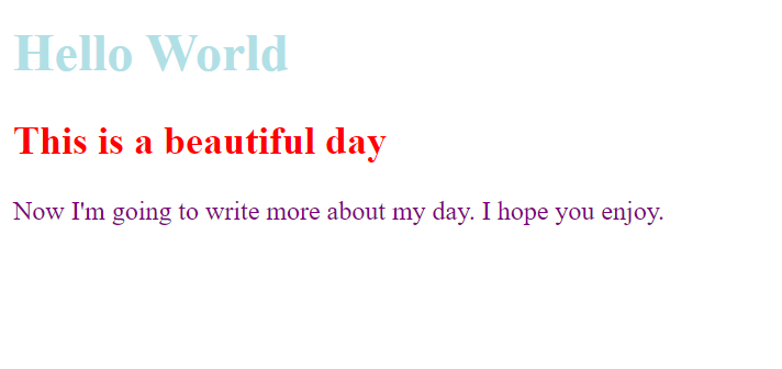
Background Color
background-color
The background-color property sets the color of the background for that box. You can specify the color in three ways: RGB values, hex codes, and color names.
Most browsers have a white background.
body {
    background-color: gray;
}


h1 {
    background-color:   rgb(176,224,230);
}


h2 {
    background-color: #FF0000;
}


p {
    background-color: purple;
}
Opacity
opacity,rgba
The opacity property will allow you to specify the opacity of an element and any of its child elements. The value is between 0.0 and 1.0 (so a value of 0.5 is 50% opacity and 0.20 is 20% opacity).
The rgba allows you to specify a color, like the RGB value, but RGBA will allow you to add a fourth value to indicate opacity. The value is known as the alpha value and the value is between 0.0 and 1.0 (same as opacity). This, however, will only affect the element on which it’s applied (not child elements).
body {
    background-color: pink;
}


#first {
    background-color: rgb(0,0,0);
    opacity: 0.50;
}


#second {
    background-color: rgba(0, 0, 0, 0.75);
}
HSL Colors
Hue
This is the everyday idea of color. Hue is often represented as a color circle where the angle represents the color.
Saturation
This is the amount of gray in a color. Saturation is represented as a percentage with 100% being full saturation and 0% being a shade of gray.
Lightness
This is the amount of white (lightness) or black (darkness). Lightness is represented as a percentage with 0% being black, 100% being white, and 50% being normal. This is sometimes referred to as luminosity.
HSL & HSLA
The hsl begins with:
Hue: Expressed as an angle (0 and 360 degrees)
Saturation: Expressed as a percentage
Lightness: Expressed as a percentage with 0% being black, 100% being white, and 50% being normal.
Hsla is similar to hsl but has an alpha included which is the transparency (opacity).
body {
    background-color: pink;
}


#first {
    background-color: hsl(0, 0%, 68%);
}


#second {
    background-color: hsla(0, 100%, 100%, 0.6);
}
Text
This will allow you to control the appearance of text.
Terminology
SERIF
Serif fonts have details on the end of the main strokes of the letters. These are known as serifs. Serif is normally used for long passages of text because they’re easier to read.
SANS-SERIF
Sans-serif has straight ends to letters which results in a much cleaner design. This is often used if the text is small as sans-serif is easier to read.
MONOSPACE
Every letter in a monospace is the same width. This is often used for code because they align nicely, making it easier to follow.

WEIGHT
Light
Medium
Bold
Black
This adds emphasis and also affects the amount of white space and contrast on a website.
STYLE
Normal
Italic
Oblique
Italic has a cursive aspect while oblique put the normal style on an angle.
STRETCH
Condensed
Regular
Extended
Condensed is where letters are thinner and closer together while expanded they are thicker and farther away from each other.
When choosing a typeface, the browser will usually display it if it’s installed on that user’s computer.
Specifying Typefaces
font-family
This will allow you to specify the typeface that should be used for any text inside that element. The value is the name of the typeface you want to use. Remember browser will not display the typeface if it’s not installed on the user’s computer.
You can specify a list of fonts separated by commas, so if the user doesn’t have your first choice of typeface installed, the browser can use an alternative font from the list. So if I have “ font-family: Arial, Helvetica, sans-serif;” the browser will first show “Arial” typeface first and if the user doesn’t have that font installed then the browser will then show “Helvetica” and so forth.
You would want to end with a generic, common font name if all the other typefaces failed.
h1 {
    font-family: Cambria, Cochin, Georgia, Times, 'Times New Roman', serif;
}


h3 {
    font-family: Arial, Helvetica, sans-serif;
}


#first {
    font-family: Verdana, Geneva, Tahoma, sans-serif;
}

Size
font-size
This will enable you to specify the size for that font. You can do it in:
Pixels: Commonly used and is followed by the letters px
Percentages: The default size of the text in browsers is 16px, so a size of 75% would be 12px and 200% would be 32px. This could change depending if you create a rule inside the <body> element to be 75% of the default size (12px), but then create another rule that indicates the content of an element inside the <body> to be 75% size, it will be 9px (75% of the 12px size).
EM: An em is equivalent to the width of the letter m.
h1 {
    font-family: Cambria, Cochin, Georgia, Times, 'Times New Roman', serif;
    font-size: 12px;
}


h3 {
    font-family: Arial, Helvetica, sans-serif;
    font-size: 200%;
}


#first {
    font-family: Verdana, Geneva, Tahoma, sans-serif;
    font-size: 1.5em;
}

Font Choice
@font-face
This will allow you to use a font, even if it isn’t installed on the computer of the person browsing.
font-family
This specifies the name of the font.
src
This specifies the path to the font.
This video will give you a great example of font-face:
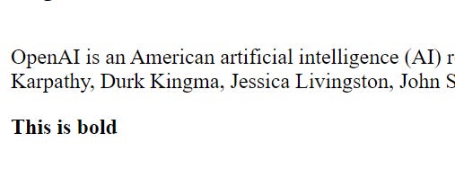
Bold
font-weight
This will allow you to create bold text. There are a bunch of values you can choose from such as:
normal
bold
lighter
100-900 (thin (100), normal (400), bold (700), and heavy (900)).
#first {
    font-weight: normal;
}


#second {
    font-weight: bold;
}
Italic
font-style
If you want to create italic text, you’ll use font-style. There are three values:
Normal: text will appear normal
Italic: text will appear in italic
Oblique: text will appear oblique
h3 {
    font-style: normal;
}


#first {
    font-style: italic;
}


#second {
    font-style: oblique;
}
Uppercase and Lowercase
text-transform
This is used to change the text in one of the following:
Uppercase: text will appear uppercase
Lowercase: text will appear in lowercase
Capitalize: causes the first letter of each word to appear capitalized.
h3 {
    text-transform: uppercase;
}


#first {
    text-transform: lowercase;
}


#second {
    text-transform: capitalize;
}
Underline and Strike
text-decoration
This will allow you to specify one of the following:
None: removes any decoration already applied to text
Underline: adds a line underneath the text
Overline: adds a line over the top of the text
Line-through: adds a line through words
There are more, but these are the most common.
h3 {
    text-decoration: underline;
}


#first {
    text-decoration: overline;
}


#second {
    text-decoration: line-through;
}
Leading
line-height
This is the vertical space between lines of text. When you increase the line height it makes the vertical gap between lines of text larger.
#first {
    line-height: 2em;
}
Letter and Word Spacing
letter-spacing, word-spacing
You can control the space between each letter with letter-spacing.
You can control the gap between words using the word-spacing property.
When you specify a value for these properties, it should be in ems. The default gap is set around 0.25em and it’s unlikely you need to change this property regularly.
#first {
    letter-spacing: 0.3em;
}


#second {
    word-spacing: 1em;
}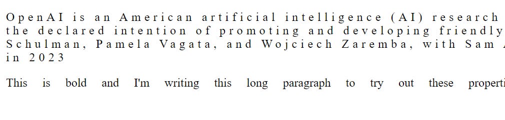
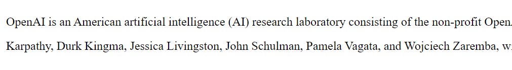
Alignment
text-align
This will allow you to control the alignment of text. There are four main values:
Left: This causes the text to be left-aligned.
Right: This causes the text to be right-aligned.
Center: This allows you to center your text.
Justify: This indicates that every line in a paragraph, except the last line, should take up the full width of the containing box.
Text is considered easier to read if it’s left-aligned.
h1 {
    text-align: justify;
}


h3 {
    text-align: left;
}


#first {
    text-align: right;
}


#second {
    text-align: center;
}
Vertical Alignment
vertical-align
This isn’t intended to allow you to vertically align text in the middle of the block-level elements. This is more commonly used with <img>. It does perform similarly to align attribute and there are a bunch of values you can choose from:
Baseline
Sub
Super
Top
Text-top
Middle
Bottom
Text-bottom
Part of HTML code:
            <div>
                <img id="pic" src="images/Screenshot (740).png" alt=""> Text-Top
            </div>


            <br>


            <div>
                <img id="pic2" src="images/Screenshot (740).png" alt=""> Baseline
            </div>


            <br>


            <div>
                <img id="pic3" src="images/Screenshot (740).png" alt=""> Text-Bottom
            </div>


            <div>
                <img id="pic4" src="images/Screenshot (740).png" alt=""> Middle
            </div>
CSS code:
#pic {
    vertical-align: text-top;
}


#pic2 {
    vertical-align: baseline;
}


#pic3 {
    vertical-align: text-bottom;

}


#pic4 {
    vertical-align: middle;
}
[End Of Part One]